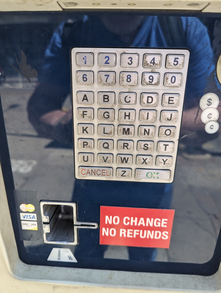
World's Dumbest Keyboard
I had to use the world’s dumbest keyboard at a parking lot in downtown Denver.

This reduces everyone, from a very good touch-typer, to a two-thumbs-texting-tornado, to doing very slow hunt-and-peck, with many extra mistakes.
The numbers aren’t in either “telephone style” (1-2-3 across the top) or “calculator style” (7-8-9 across the top). It’s not easy to do numeric input this way.
This garbage layout causes all transactions to take longer than they could. People pile up waiting for the first person in line to pay for their parking spot. Just exceptionally bad design and utter lack of human factors. The only thing the designers of this kiosk could have done worse was to put a screen on it such that bright sunlight washed out differences between text and background. The kiosk’s screen is actually adequately bright, unlike downtown Denver parking meters which you end up doing blind in bright sunlight.
