Dobby Got Wedged
My pet Roomba, Dobby, got himself good and stuck under an overstuffed easy chair.
Over the past couple of months, Dobby has started to get stuck in some really puzzling places, like the middle of the floor. One time, he bounced around in a door frame for 4 or 5 minutes, and generally didn’t vacuum much of anything.
This often causes Dobby to reboot, and both “The App” and Dobby’s pre-recorded voice claim that an “error 15” has happened.
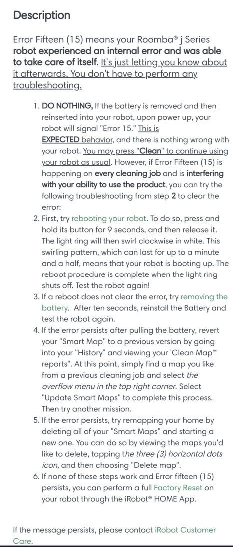
This is unusually incoherent, even by corporate documentation standards. Dobby claimed there was an Error Fifteen (15). “The App” tells me that Dobby “experienced an internal error” and was “able to take care of itself”. I don’t have to perform any further troubleshooting.
In that case, why bother to tell me this at all?
When Dobby has an incredibly grotesque and horrible error fifteen (15), he reboots.
Step 2 (two) is redundant, as is the lame attempt at officialese by using a number, say 3, then writing out the number in parentheses “(three)”. I believe this practice originated back when some documents were often typewritten instead of typeset. Typewriters fonts were such that a capital-O and a Zero were visually indistinguishable. Some typewriters didn’t even have a Zero or a One, forcing the typists to use capital-O and lowercase-l as digits. Modern fonts don’t usually have this deficiency. iRobot’s use of an antique technique to look thorough, official and dedicated just makes the documentation seem Stalinist.
Step 5 (five) illustrates my thesis that point-n-clicky interfaces are ambiguous. The “3 (three) horizontal dots” description of an “intuitive” icon is risible. If it’s so darn intuitive, why do we get a big, multi-word description featuring “horizontal dots”? That’s rhetorical, it’s not an intuitive icon, and “dots” don’t have an orientation. They’re round.
In any case, I took them up on Step 5 and remapped my house. After that, I sent Dobby out to do some vacuuming, and he got himself wedged hard.
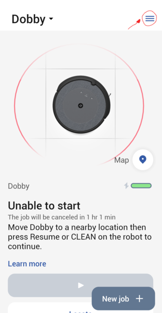
This is what “The App” showed when Dobby got himself wedged.
Notice the “3 (three) horizontal dots” icon.
I’ve circled it in red.
See the dots? Me neither, I see little bars.
“3 (three) horizontal dots” could possibly look like a large ellipsis, ...,
not a vertical stack of 3 bars.
While it’s possible that the Android app has a change that the documentation misses,
because of terrible “flat design”, the “3 (three) horizontal dots” in “The App”
aren’t even obviously something you should tap or click on.
An unintuitive image, called by a misleading name.
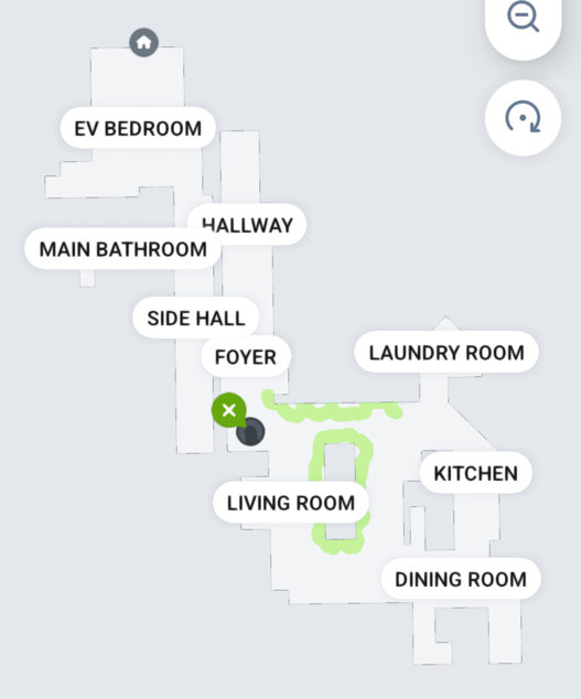
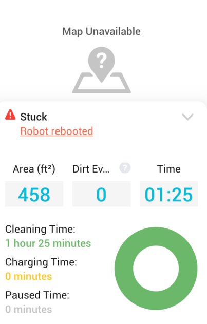
Anyway, here’s where Dobby thought he got wedged. It’s more-or-less correct. What’s puzzling is the areas he vacuumed (indicated in green) before getting stuck. How does vacuuming around some easy chairs in the middle of the room fit with vacuuming along one edge? I’m baffled by the logic used by Roombas when actually doing their jobs.
The actual map of my house’s first floor is not the same as the original map Dobby made a year ago. Both maps are stretched. I think this is the result of mapping based on Roomba’s doing dead reckoning from wheel turns. I’ll be keeping my eye on Dobby to see if re-mapping results in fewer “Error 15 (fifteen)” codes when vacuuming.
